Table Graphics
Scatter Chart
Histogram
Time Series
Swarm Chart
Radar Charts
Bar Chart
Stacked Bar Chart
Diverging Stacked Bar Chart
Contact Us
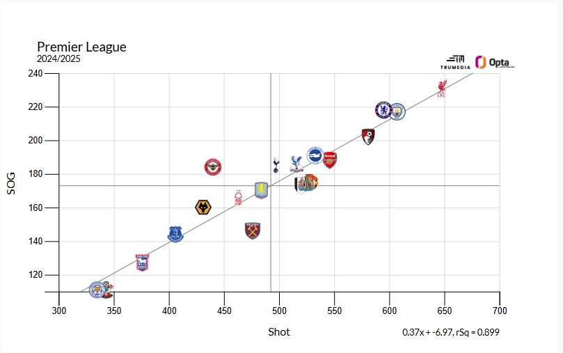
Scatter Chart
A scatter chart shows the relationship between two stats. In the example below we have Shots on the horizontal x-axis and Shots on Target on the vertical y-axis.
Liverpool stand out in the top right. They took the most shots and had the most on target in the league this season. In the middle of the chart, Brentford, although taking an average amount of shots, had an above average amount of shots on target. This is both evident in the position along the y-axis but also relative to the trendline.
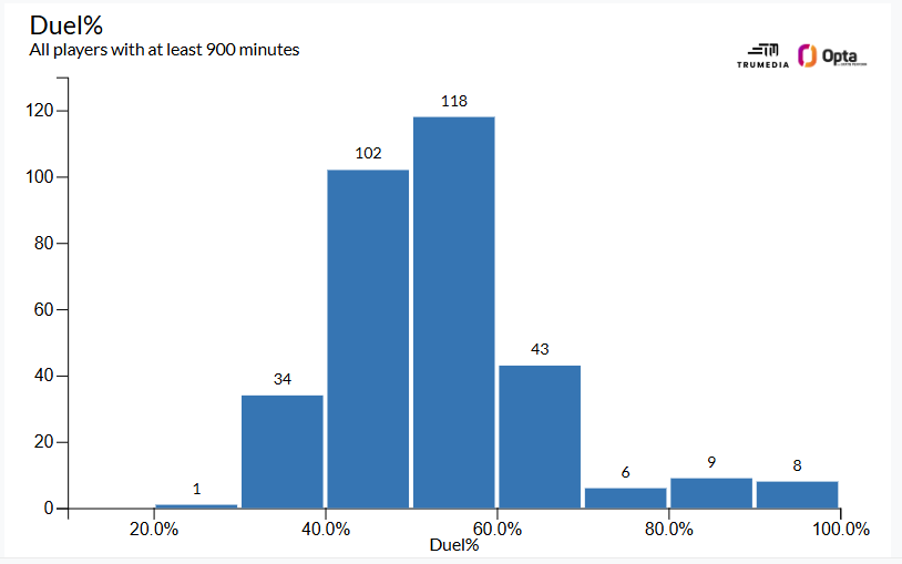
Histogram
A histogram shows the frequency distribution of a stat. This example shows duel success percentage and the tallest bar in the middle of the chart represents 118 players with a duel success percentage between 50% and 60%.
On the right side, we see two of the shorter bars on the chart. These represents the 17 players in the league with a duel success percentage over 80%. On the left, there is one player with a percentage under 30%.
Hover over a bar to see the teams/players and stats represented in that bucket and their exact values.
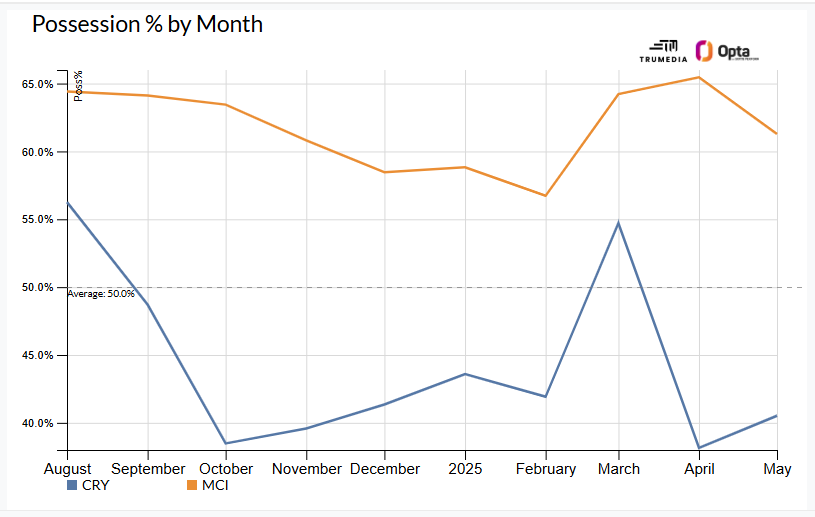
Time Series Chart
A time series chart shows trends in the data over time. The example below shows team possession percentage by month for Crystal Palace and Manchester City in the Premier League in 2024/2025.
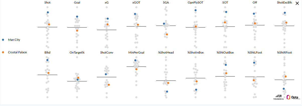
Swarm Chart
A swarm chart visualizes the distribution of multiple stats and, by hovering over a dot, you can see the value of an individual data point. This chart plots all metrics on a chosen report or one metric at a time. Each point on the chart represents a team’s performance in that metric and the black line in the middle displays the league average.
The dots at the top of a chart represent the best performance in that metric and the dots at the bottom are the worst performers.
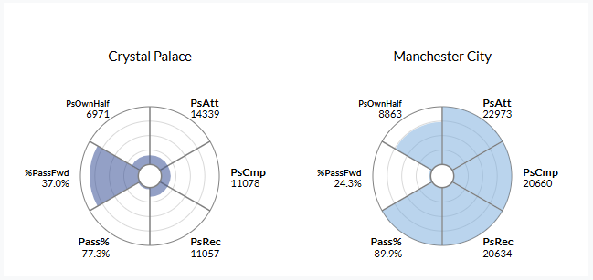
Radar Charts
Radar charts visualize player and team performance relative to the league. Each section of the chart represents a particular stat, with the size of the section determined by where that stat ranks against the league. This example shows Crystal Palace with a 37% in Percentage of Passes that go forward statistic, which was in the 87th percentile of the league. In contrast, Manchester City’s 24.3% was last in the league, or in the 0th percentile, which is shown with no area filled in.
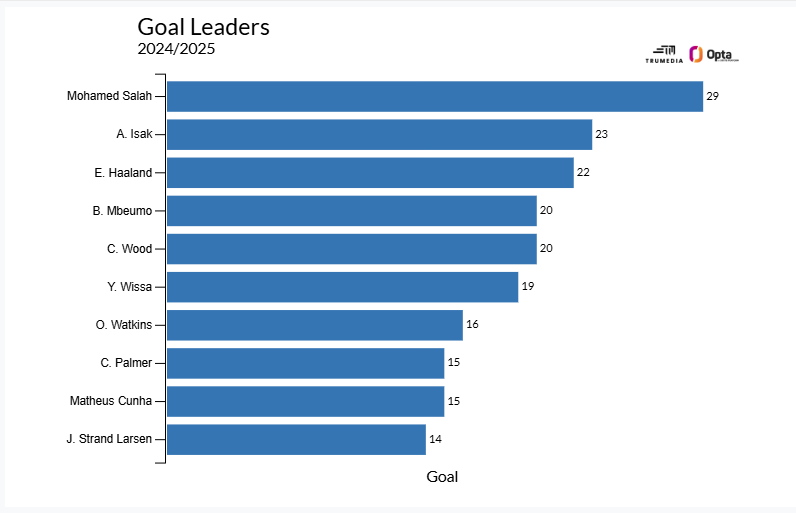
Bar Chart
A bar chart is used to compare performance for one stat; the size of the bar on the chart corresponds to the number value. The example below shows goals for the top ten players in the Premier League in 2024/2025.
The league leader was Mohamed Salah with 29 goals; this is represented by the largest blue bar at the top of the chart. At the bottom of the chart is Jørgen Strand Larsena with 14 goals. His bar is smaller.
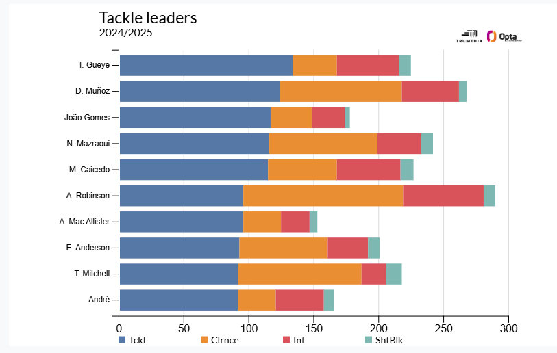
Stacked Bar Chart
A stacked bar chart visualizes more than one stat on a single chart. This example shows the top 10 players in tackles in 2024/2025, with additional stats including Clearances, Interceptions, and Blocked Shots.
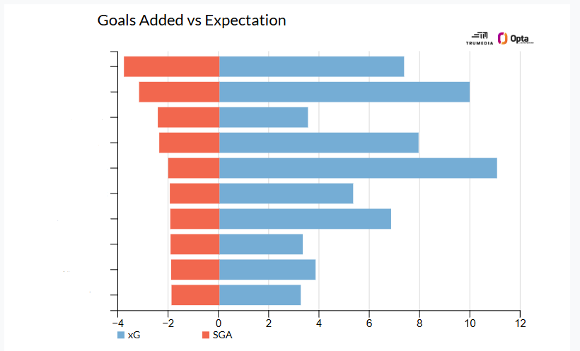
Diverging Stacked Bar Chart
Similar to the Stacked Bar Chart, the Diverging version allows charting of negative values. In this example, the chart is showing Goals Added vs. Expectation. The red bars indicate a negative value (Goals Added) and the blue bars indicate a positive value (Expected Goals).
Contact Us
Email the Support team